
NDIS website design: accessible, plain-English websites that reassure participants, families and the coordinators who refer them, and turn visits into enquiries. Bundled free with 12 month growth plans.
Your website is the first interaction most participants and coordinators have with your organisation. It needs to say what you do, where, and for whom in plain English, prove you can be trusted, and make enquiring effortless for people of all abilities. With 5.5 million Australians (21.4%) living with disability, a site many of your visitors physically cannot use is not a niche problem. Most provider websites still miss at least one of these basics.
Participants, families and support coordinators read differently. The site serves all three.
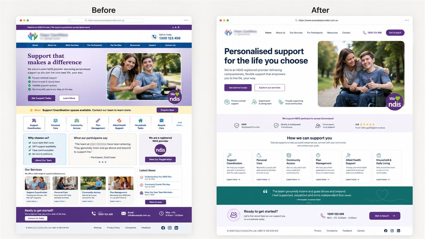
After reviewing hundreds of provider websites, the same four failures appear again and again. The homepage never says which suburbs you service, so coordinators bounce in seconds. The photos are stock-perfect strangers, so families feel nothing. The enquiry form is buried on a contact page, three clicks deep. And the site fails basic accessibility, which excludes the very people the provider exists to support.
The stakes are higher than they look. The NDIS now funds 717,001 participants (as at 31 March 2025), and in our experience running campaigns for providers, almost every one of those participants, families and the coordinators who refer them looks you up online before they make contact. A site that states services and regions on the first screen holds visitors far longer than one that makes them dig. Real photography lifts enquiries because trust in this sector is bought with faces, not adjectives. An enquiry path on every page catches the visitor at the moment of decision instead of asking them to go looking.
We bake all four fixes in from the wireframe, then test against them before launch. It is a checklist, not a philosophy, which is why it holds up.
Every site we build is tested against WCAG 2.2 AA, not just designed to look accessible. The standards and timelines here reflect real provider builds. Get a free website review.
A good NDIS website does three jobs at once: it builds trust, it is accessible to everyone, and it is built to rank and convert. A site that only looks nice but loads slowly, fails accessibility or buries the enquiry button quietly costs you participants. Here is what we build in.
Proper colour contrast, keyboard navigation, alt text and a readable structure mean your site works for participants of all abilities. We test to WCAG 2.2 AA, the current W3C accessibility standard. For a disability-sector provider this is both the right thing to do and the level families and coordinators quietly expect when they judge whether you understand your own clients.
Fast loading, clean code and a logical page structure mean the site supports your rankings instead of holding them back. We build the on-page foundations in from the start, because retrofitting SEO onto a poorly built site is slow and expensive.
Dedicated pages for each service and area you cover, written around what participants, families and coordinators actually want to know. This is what lets you rank for specific services and suburbs rather than relying on a single thin homepage.
Reviews, credentials, clear calls to action and an easy enquiry path turn visitors into enquiries. Most provider sites get traffic but lose people at the point of contact; we design that path deliberately.
We include a simple CRM so enquiries are captured and managed in one place, and we can host, maintain and update the site after launch so it stays fast, secure and compliant over time.
As a standalone project, discounted or included when bundled with a 6 to 12 month growth plan. Beware $25-a-week template sites: they are cheap because nothing is customised, including the things that make participants enquire.
WCAG 2.2 AA is the practical benchmark. It covers strong colour contrast for low vision, full keyboard navigation, and descriptive alt text for screen readers. We build and test every site to that level because your audience includes people with disability and Google rewards accessible, fast sites.
Yes. 5.5 million Australians (21.4%) live with disability, so a meaningful share of your visitors rely on screen readers, keyboard navigation or high contrast. Accessibility (WCAG) is both an ethical baseline and a practical one: accessible sites are faster, clearer and easier for everyone, including Google.
A website is not strictly required to register, but in practice you need one. With 717,001 participants in the scheme (March 2025) and a coordinator-led referral market, people check you online before they enquire or refer. In our experience a clear, accessible site is often the difference between being shortlisted and being skipped.
Plain-English services and regions, real photos, visible vacancy availability if you offer SIL or SDA, an enquiry form and phone number on every page, and proof such as reviews and case studies.
Four to six weeks from kickoff to launch for most providers, including two revision rounds. Content gathering from your side is usually the long pole.
A specialist reviews your current site against what participants and coordinators need, and sends you the gaps. Free, no obligation.
A specialist reviews your visibility against the providers competing in your catchment, and sends a written growth plan within two business days. You keep it either way.